고정 헤더 영역
상세 컨텐츠
본문
▶ 미디어쿼리 분기점 (media query breakpoints)
- 낮은 해상도의 PC, 태블릿 가로 : ~1024px
- 테블릿 가로 : 768px ~ 1023px
- 모바일 가로, 태블릿 : 480px ~ 767px
- 모바일 : ~ 480px
낮은 해상도의 PC, 태블릿PC , 테블릿 가로 (해상도 768px ~ 1023px)
@media all and (min-width:768px) and (max-width:1023px) { }
테블릿 세로 (해상도 768px ~ 1023px)
@media all and (min-width:768px) and (max-width:1023px) { }
모바일 가로, 테블릿 세로 (해상도 480px ~ 767px)
@media all and (min-width:480px) and (max-width:767px) { }
모바일 가로, 테블릿 세로 (해상도 ~ 479px)
@media all and (max-width:479px) { }
조금 더 크게 묶어 아래와 같이 사용하기도 함.
- 반응형 PC
@media screen and (min-width:1024px) { /* PC CSS */ }
- 반응형 테블릿
@media screen and (min-width:768px) and (max-width: 1023px) {/* 테블릿 CSS */}
- 반응형 모바일
@media screen and (max-width:767px){/* 모바일 CSS */ }
<!-- header -->
<header>
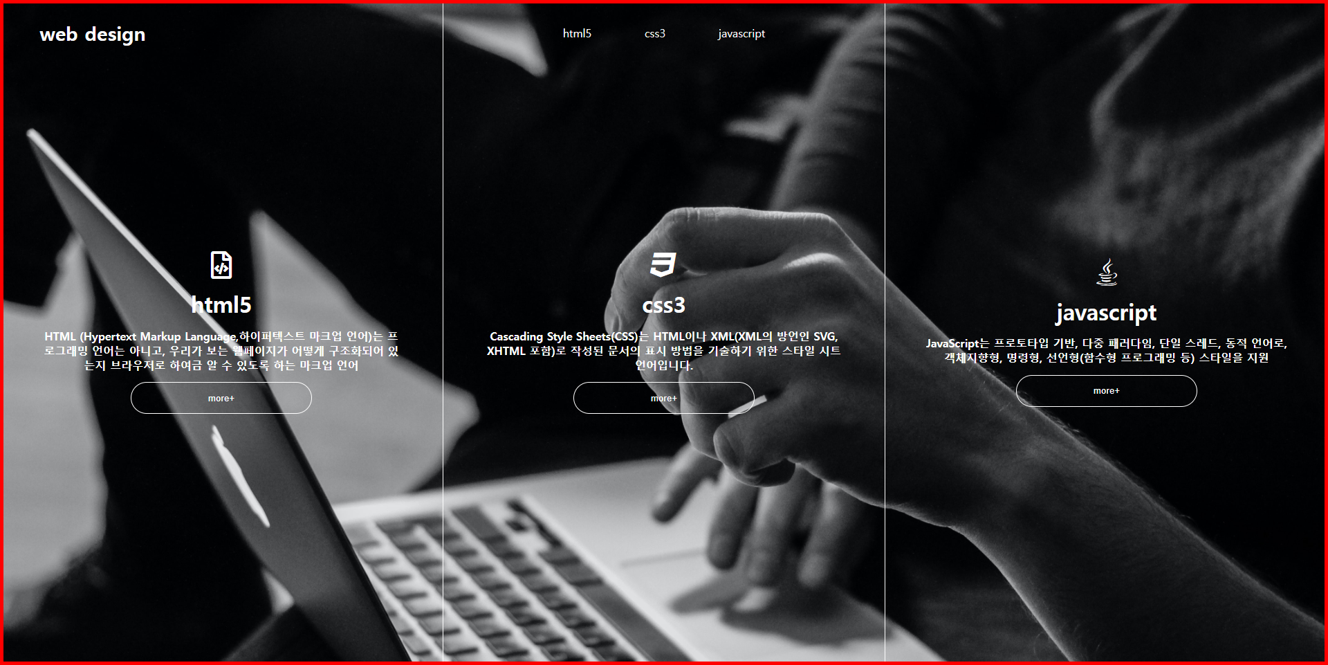
<a href="index.html">web design</a>
<ul>
<li><a href="#">html5</a></li>
<li><a href="#">css3</a></li>
<li><a href="#">javascript</a></li>
</ul>
</header>
<!-- //header -->
<!-- section -->
<section>
<article>
<div>
<i class="far fa-file-code"></i>
<h1>html5</h1>
<h4>
HTML (Hypertext Markup Language,하이퍼텍스트 마크업 언어)는 프로그래밍 언어는 아니고, 우리가 보 는 웹페이지가 어떻게 구조화되어 있는지 브라우저로 하여금
알 수 있도록 하는 마크업 언어
</h4>
<button type="button">more+</button>
</div>
</article>
<article>
<div>
<i class="fab fa-css3"></i>
<h1>css3</h1>
<h4>
Cascading Style Sheets(CSS)는 HTML이나 XML(XML의 방언인 SVG, XHTML 포함)로 작성된 문서의 표시 방법을 기술하기 위한 스타일 시트
언어입니다.
</h4>
<button type="button">more+</button>
</div>
</article>
<article>
<div>
<i class="fab fa-java"></i>
<h1>javascript</h1>
<h4>
JavaScript는 프로토타입 기반, 다중 패러다임, 단일 스레드, 동적 언어로, 객체지향형, 명령형, 선언형(함 수형 프로그래밍 등) 스타일을 지원
</h4>
<button type="button">more+</button>
</div>
</article>
</section>
<!-- //section -->
*{
padding: 0;
margin: 0;
transition: all 0.4s ease;
}
a{
text-decoration: none;
color: inherit;
}
li{
list-style: none;
}
body{
background: url(../img/bg.jpg) no-repeat;
background-size: cover;
color: #fff;
}
/* header */
header{
height: 10vh; >>100px
width: 100%;
position: absolute;
line-height: 10vh; >>100px
text-align: center;
/* ul의 중앙정렬 */
/* background-color: ivory; */
}
header>a{
position: absolute;
left: 3%;
font-weight: 900;
font-size: 28px;
}
header ul{
display: inline-block;
/* ul의 폭이 명확하지 않기 때문에 */
}
header ul li{
float: left;
padding: 0 2vw; >>20px
}
/* section */
section{
display: table;
/* 부모 테이블 성격 변환 */
width: 100%;
height: 100vh; >>1000px
table-layout: fixed;
/* 내요물 동일하게 분매 */
}
article{
display: table-cell;
/* td성격 부여 */
text-align: center;
vertical-align: middle;
/* 수직상 컨텐츠 중앙정렬 */
padding: 0 3vw; >>30px
}
article:nth-child(2){
border-left: 1px solid #fff ;
border-right: 1px solid #fff ;
}
article i{
font-size: 40px;
}
article h1{
font-size: 32px;
margin: 1.5vh 0;
}
article button{
width: 50%;
padding: 1.5vh 0;
border: 1px solid #fff;
border-radius: 50px;
color: #fff;
background: none;
margin-top:1.5vh;
}
article:hover{
background-color: rgba(0, 0, 0, 0.5);
}
/* 낮은 해상도 pc / 태블릿 기준 */
@media screen and (max-width:1024px) {
header ul{
display: none;
/* 제거 */
}
article{
display: table;
/* td > table부모로 변경 */
height: 33.1vh;
}
article:nth-child(2){
border-left: none;
border-right: none;
border-top: 1px solid #fff;
border-bottom: 1px solid #fff;
}
article>div{
display: table-cell;
vertical-align: middle;
}
}
'♥ 코딩(Coding) > 반응형' 카테고리의 다른 글
| ( 공부복습 ) flex 레이아웃 활용 / flex_item속성 (자식) (0) | 2022.01.20 |
|---|---|
| ( 공부복습) flex 레이아웃 (0) | 2022.01.20 |
| ( 공부복습 ) table 레이아웃의 활용_응용 (0) | 2022.01.15 |
| ( 공부복습 ) table 레이아웃 (0) | 2022.01.12 |
| ( 공부복습 ) 기초 반응형 레이아웃 설계 (0) | 2022.01.12 |


