( 공부복습 ) 반응형웹 & 가변그리드 연습문제
★ 문제 ★

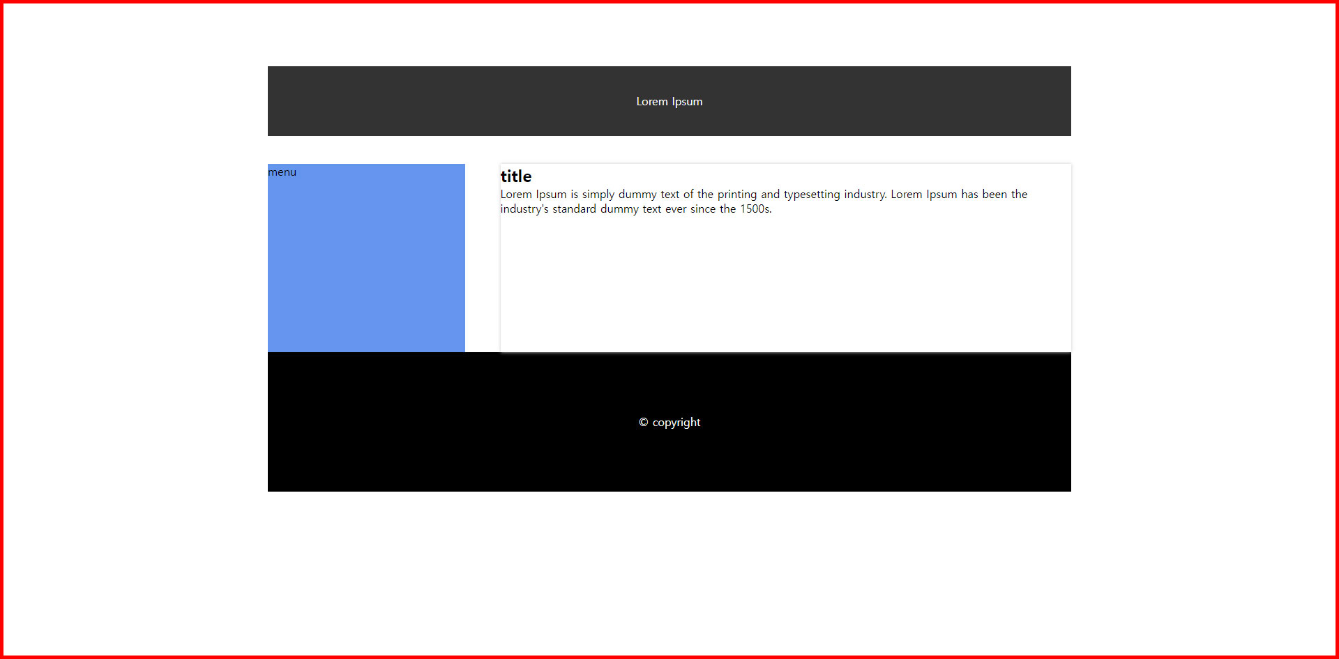
<!DOCTYPE html>
<html lang="ko">
<head>
<meta charset="UTF-8">
<meta http-equiv="X-UA-Compatible" content="IE=edge">
<meta name="viewport" content="width=device-width, initial-scale=1.0">
<title>연습문제</title>
<link href="style2.css" rel="stylesheet" type="text/css">
</head>
<body>
<div id="wrap">
<header>Lorem Ipsum</header>
<section>menu</section>
<aside>
<h2> title</h2>
<p>
Lorem Ipsum is simply dummy text of the printing and typesetting industry.
Lorem Ipsum has been the industry's standard dummy text ever since the 1500s.
</p>
</aside>
<footer>© copyright</footer>
</div>
</body>
</html>

*{
>> 기본사항
padding: 0;
margin: 0;
}
#wrap{
width: 60%;
/* 1140/1900 =0.6*100 =60% */
overflow: hidden;
margin: 60px auto;
padding: 30px;
}
header{
width: 100%;
>> 부모의 1140px과 동일하기에 100%처리
height: 100px;
background-color: #333;
color: #fff;
line-height: 100px;
text-align: center;
margin-bottom: 40px;
}
section{
width: 24.56%;
/* 280/1140=0.2456*100 = 24.56%*/
height: 270px;
background-color: cornflowerblue;
float: left;
}
aside{
width: 71.05%;
/* 810/1140=0.7105*100 =71.05%*/
height: 270px;
float: right;
background-color: #fff;
box-shadow: 0 0 5px #ccc;
}
footer{
width: 100%;
>> 부모의 1140px과 동일하기에 100%처리
height: 200px;
background-color: #000;
color: #fff;
text-align: center;
line-height: 200px;
clear: both;
}


★ 완성본 ★